

Create visually stunning and cohesive spaces with the right lighting strategy
When designing a commercial interior—whether it’s a retail showroom, office space, or a hospitality venue—lighting and color must work together. Many people choose a beautiful color palette but forget how lighting will affect its appearance. The result? Poor ambiance, uneven tones, or a mismatched aesthetic.
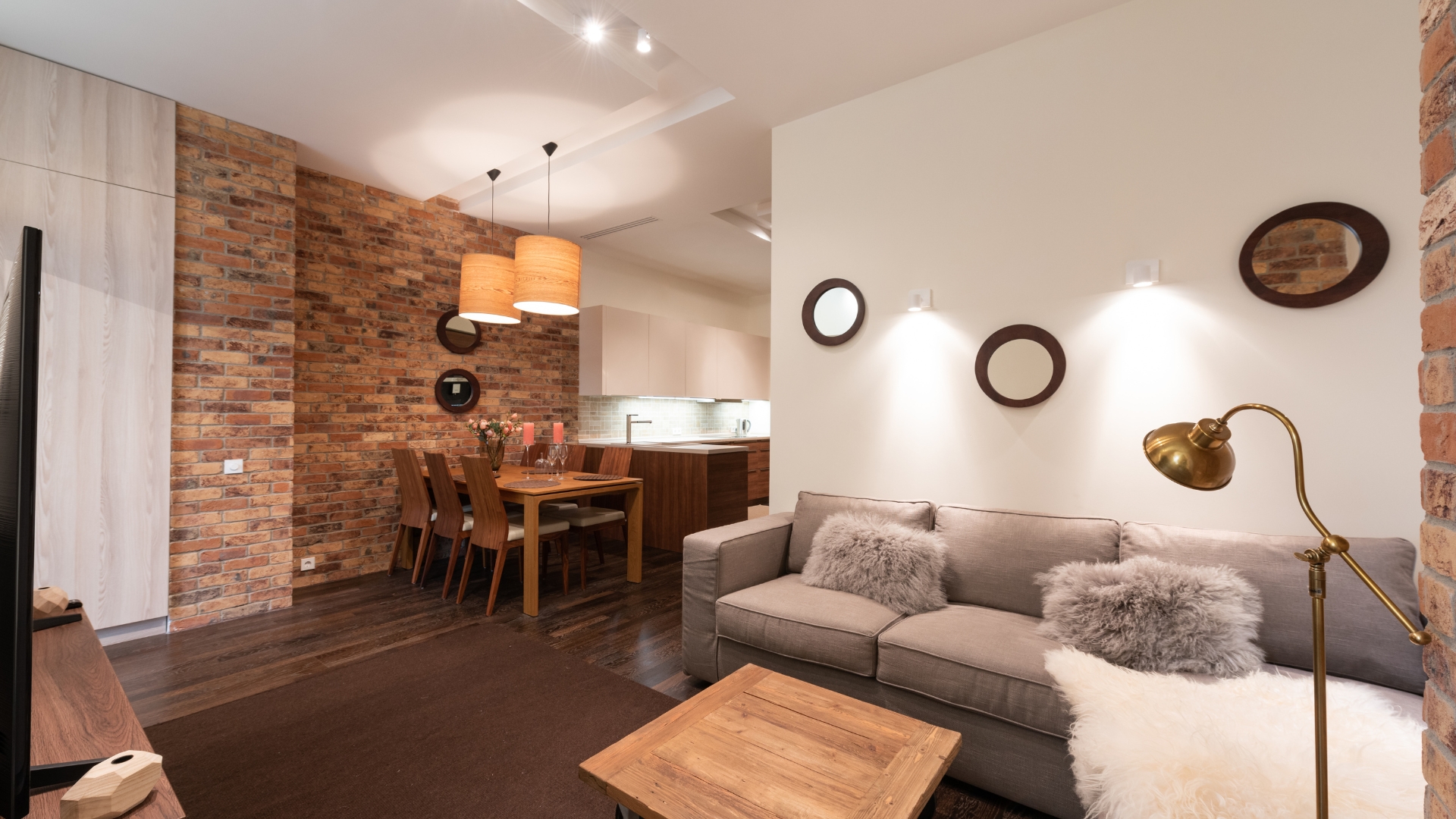
At Glow Right, we understand how powerful lighting can be. Here's a guide on how to perfectly match commercial lighting with your interior color schemes.
1. Understand Color Temperature First
The color temperature of a light source determines how "warm" or "cool" the light feels.
-
Warm White (2700K–3000K): Best for earthy tones, wood, creams, and cozy environments (like cafes or lounges).
-
Neutral White (3500K–4100K): Works well with whites, grays, and modern aesthetics—great for retail and commercial offices.
-
Cool White / Daylight (5000K–6500K): Best for bright, clean, and high-focus areas like hospitals, tech offices, and showrooms.
Pro Tip: Use warmer lights to soften bold color schemes and cooler lights to enhance cooler tones.
2. Complement, Don’t Clash
When you’ve already chosen your interior color palette, your lighting should enhance it—not compete with it.
| Color Scheme | Best Light Type | Why It Works |
|---|---|---|
| Neutral (beige, gray, white) | Neutral or warm white | Adds depth without overpowering |
| Bold (reds, oranges, deep blue) | Warm white or dimmable lighting | Softens intense colors, adds richness |
| Cool tones (mint, navy, lavender) | Cool white or daylight | Sharpens contrast and keeps it crisp |
3. Use Layered Lighting to Highlight Colors
Rather than relying on just one light source, create layers:
-
Ambient Lighting: General room lighting (ceiling panels, concealed lights)
-
Accent Lighting: To highlight colors/art on walls (spotlights or track lights)
-
Task Lighting: Specific areas like counters or desks (LED panels or strips)
This not only enhances functionality but also brings out the depth of your color palette.
4. Consider the Surface Finish
Glossy surfaces reflect light, while matte ones absorb it. Use lighting to control the visual effect:
-
Glossy white wall + cool light = very bright, clean look
-
Matte dark wall + warm light = cozy, subdued atmosphere
Don’t just focus on the paint color—look at the materials, texture, and finish of your walls, furniture, and flooring.
5. Adapt for Purpose & Brand Identity
Your lighting and color choice should reflect your brand’s mood and function.
-
Retail Store: Use bright cool lighting to energize customers and make colors pop.
-
Corporate Office: Neutral lighting for professionalism and reduced eye strain.
-
Luxury Interior: Warm lighting with soft dimmers to match golds, blacks, and deep hues.
Every brand has a personality. Let your lighting reflect it.
6. Test Before You Finalize
Use sample swatches of wall paint and furniture under actual lighting conditions before finalizing the setup. Light changes color perception dramatically—what looks perfect in the showroom might appear completely different on-site.
Final Thoughts
Matching commercial lighting with your interior color scheme isn’t just about aesthetics—it's about creating an atmosphere, enhancing brand presence, and improving the customer or employee experience.
If you're planning a lighting setup, explore our wide range of commercial and decorative LED lights at Glow Right—designed to match every palette and purpose.